
A/B testing, sometimes also referred to as split testing, is the process of comparing two versions of content, image, email, webpage, or other marketing collaterals to determine which performs better. You give each version to two different groups and see how they communicate with each variation. A/B testing helps to make an informed decision by letting you know which version works better among the customers. In this analysis, we will compare the performance of the marketing groups in a fast-food chain.
1. Questions
This analysis will try to answer the following questions:
- Which promotion group makes the most sales?
- What are the main market size occupied the most by the promotion groups?
- What are the age of the stores selected by the promotion group?
- Using hypotheis testing, which promotion group performs the best.
2. Measurement Priorities
- Amount of sale made from the marketing groups.
- t-value and p-value from sales.
- Age and location of the stores assigned for the marketing groups.
3. Data Collection
- Source
- The data is obtained from the Kaggle
- Storage
- The cleaned data will be stored in a CSV file.
Github link for project
Import dataset
import pandas as pd
import numpy as np
#read csv file
df = pd.read_csv('Dataset\WA_Marketing-Campaign.csv')
#preview dataframe
df.head()
| MarketID | MarketSize | LocationID | AgeOfStore | Promotion | week | SalesInThousands | |
|---|---|---|---|---|---|---|---|
| 0 | 1 | Medium | 1 | 4 | 3 | 1 | 33.73 |
| 1 | 1 | Medium | 1 | 4 | 3 | 2 | 35.67 |
| 2 | 1 | Medium | 1 | 4 | 3 | 3 | 29.03 |
| 3 | 1 | Medium | 1 | 4 | 3 | 4 | 39.25 |
| 4 | 1 | Medium | 2 | 5 | 2 | 1 | 27.81 |
EDA
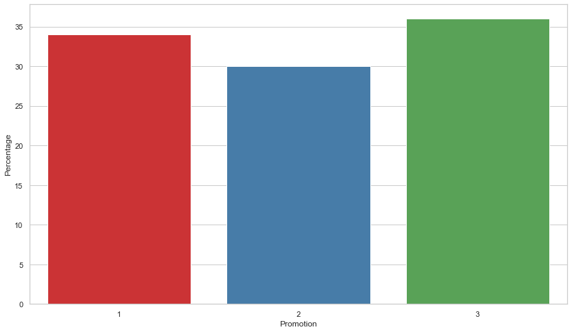
Which promotion group makes the most sales?
Results: From the chart we can see that the promotion done by Group 3 had the most aggregate sales amount which is 36%. All of the groups made roughly 1/3 of the total sales during the time of the promotion week.
import matplotlib.pyplot as plt
import matplotlib.patches as mpatches
import matplotlib.ticker as mtick
import seaborn as sns
#default styling
sns.set_theme(style="whitegrid")
p_distinct='Set1'
#group the data by promotion groups
ts_g = df.groupby(['Promotion']).sum()
#reset the index
ts_g.reset_index(inplace=True)
#calculate overall sales percentage of each promotion group
ts_g['Percentage'] = round((ts_g['SalesInThousands']/df['SalesInThousands'].sum())*100)
#preview data
ts_g.head()
| Promotion | MarketID | LocationID | AgeOfStore | week | SalesInThousands | Percentage | |
|---|---|---|---|---|---|---|---|
| 0 | 1 | 996 | 84016 | 1424 | 430 | 9993.03 | 34.0 |
| 1 | 2 | 1108 | 93520 | 1500 | 470 | 8897.93 | 30.0 |
| 2 | 3 | 1028 | 85316 | 1736 | 470 | 10408.52 | 36.0 |
#plot the data
fig =plt.figure(figsize=(14,8))
sns.barplot(x='Promotion',y='Percentage', data=ts_g,palette = p_distinct)
plt.show()
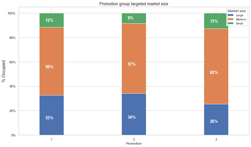
What are the main market size occupied the most by the promotion groups?
Results: The stacked bar plot shows that the market size occupied the most by the promotion group is the medium market size which is over 55% by all promotion groups while the small market size being the least.
contract_churn = df.groupby(['Promotion','MarketSize']).size().unstack()

ax = (contract_churn.T*100.0 / contract_churn.T.sum())\
.T.plot(kind='bar',
        width = 0.3,
        stacked = True,
        rot = 0,
        figsize = (14,8),
        #color=triple_color
       )

ax.yaxis.set_major_formatter(mtick.PercentFormatter())
ax.legend(loc='best',prop={'size':10},title = 'Market size')
ax.set_ylabel('% Occupied',size = 14)
ax.set_title('Promotion group targeted market size',size = 14)

# Code to add the data labels on the stacked bar chart
for p in ax.patches:
    width, height = p.get_width(), p.get_height()
    x, y = p.get_xy()
    ax.annotate('{:.0f}%'.format(height),
                (p.get_x()+.25*width, p.get_y()+.4*height),
                color = 'white',
                weight = 'bold',
                size = 14)
plt.show()
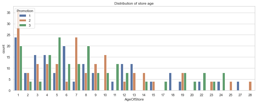
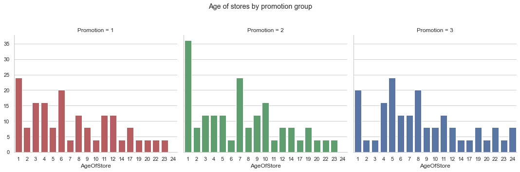
What are the age of the stores selected by the promotion group?
Results: Most of the stores are 10 years old and below with most of the stores being 1 year old. The mean store age for all of the promotion groups are around 8-9 years old with the majority of the stores are 10-12 years old or younger.
fig = plt.figure(figsize=(14,5))
plt.title("Distribution of store age")
sns.countplot(x='AgeOfStore',data=df,hue='Promotion')
plt.show()
d = {'color': ['r','g','b']}
g = sns.FacetGrid(df, col="Promotion",palette='mako',height=5, aspect=1,hue_kws=d, hue='Promotion')
g.map(sns.countplot, "AgeOfStore",color='b')
g.fig.subplots_adjust(top=0.8)
g.fig.suptitle('Age of stores by promotion group')
plt.show()
C:\Users\Haziq\Anaconda3\lib\site-packages\seaborn\axisgrid.py:643: UserWarning: Using the countplot function without specifying `order` is likely to produce an incorrect plot.
  warnings.warn(warning)
for i in df.Promotion.sort_values().unique():
    print('Promotion '+ str(i))
    print(df.AgeOfStore[df['Promotion']==i].describe())
    print('\n')
Promotion 1
count    172.00000
mean       8.27907
std        6.63616
min        1.00000
25%        3.00000
50%        6.00000
75%       12.00000
max       27.00000
Name: AgeOfStore, dtype: float64


Promotion 2
count    188.000000
mean       7.978723
std        6.597648
min        1.000000
25%        3.000000
50%        7.000000
75%       10.000000
max       28.000000
Name: AgeOfStore, dtype: float64


Promotion 3
count    188.000000
mean       9.234043
std        6.651646
min        1.000000
25%        5.000000
50%        8.000000
75%       12.000000
max       24.000000
Name: AgeOfStore, dtype: float64
Conclusion: After prforming EDA on the datset’s variables, we can verify that there are similarities in the sample group which makes the A/B testing results to be meaningful and trustworthy.
Hypothesis testing
For A/B testing, the T-test is commonly used. The t-test compares the two averages and determines whether or not they differ significantly.
The t-value and the p-value are two important statistics in a t-test. The t-value indicates how much of a difference there is in comparison to the variation in the data. The greater the t-value, the greater the difference between two testing groups. The P-value indicates the likelihood that the result occurred by chance. As a result, the smaller the p-value, the greater the statistical significance of the difference between two testing groups.
t-value and p-value
#get seperate sales value for each promotion group
gp_1 = df.SalesInThousands[df['Promotion']==1]
gp_2 = df.SalesInThousands[df['Promotion']==2]
gp_3 = df.SalesInThousands[df['Promotion']==3]
#mean
gp_1_mean = gp_1.mean()
gp_2_mean = gp_2.mean()
gp_3_mean = gp_3.mean()

#standard deviation
gp_1_std = gp_1.std()
gp_2_std = gp_2.std()
gp_3_std = gp_3.std()

#number of samples
gp_1_n = len(gp_1)
gp_2_n = len(gp_2)
gp_3_n = len(gp_3)
# import math library
import math as m
#t-value comparing promotion 1 and promotion 2
t_value_1_2 = (gp_1_mean -gp_2_mean)/m.sqrt((gp_1_std ** 2 / gp_1_n + gp_2_std ** 2/gp_2_n))
#degree of freedom
dfr_1_2 = gp_1_n +gp_2_n - 2
import scipy.stats

#find p-value for two-tailed test
p_value_1_2 = scipy.stats.t.sf(abs(t_value_1_2), df=dfr_1_2)*2
print("t-value: " + str(t_value_1_2))
print("p-value: " + str(p_value_1_2))
t-value: 6.427528670907475
p-value: 4.1432972177085943e-10
We got the t-value of 6.4275 and p-value of 4.143e-10 (which is an extremely small number) that suggest that there is strong evidence against the null hypothesis and that the difference between Group 1 and Group 2 is significant. Therefore, Group 1 outperform Group 2.
#t-value comparing promotion 1 and promotion 3
t_value_1_3 = (gp_1_mean -gp_3_mean)/m.sqrt((gp_1_std ** 2 / gp_1_n + gp_3_std ** 2/gp_3_n))

#degree of freedom
dfr_1_3 = gp_1_n +gp_3_n - 2
#find p-value for two-tailed test
p_value_1_3 = scipy.stats.t.sf(abs(t_value_1_3), df=dfr_1_3)*2
print("t-value: " + str(t_value_1_3))
print("p-value: " + str(p_value_1_3))
t-value: 1.5560224307759114
p-value: 0.12058631176433682
Here we got the t-value of 1.5560 and the p-value of 0.1205 (which is much higher than 0.05). This result suggests that there is no statistically significant difference between Group 1 and Group 3 even though the average sales from promotion Group 1 (58.1) is higher than in Group 3 (55.36).
#printing t-value, p-value and means
print("t-value for Group 1 and 2: "+str(t_value_1_2))
print("p-value for Group 1 and 2: "+str(p_value_1_2))
print("\n")
print("t-value for Group 1 and 3: "+str(t_value_1_3))
print("p-value for Group 1 and 3: "+str(p_value_1_3))
print("\n")
print("Group 1 Mean: "+str(gp_1_mean))
print("Group 2 Mean: "+str(gp_2_mean))
print("Group 3 Mean: "+str(gp_3_mean))
t-value for Group 1 and 2: 6.427528670907475
p-value for Group 1 and 2: 4.1432972177085943e-10


t-value for Group 1 and 3: 1.5560224307759114
p-value for Group 1 and 3: 0.12058631176433682


Group 1 Mean: 58.099011627907046
Group 2 Mean: 47.329414893617084
Group 3 Mean: 55.36446808510637
AB Test Results : Without the A/B test, we can simply say Group 1 and Group 3 perform better than Group 2 by looking at the average sales. However, the difference between Group 1 and Group 3 is not statistically significant. Therefore, the company can use either marketing strategies from Group 1 and Group 2 marketing strategies for their fast-food retail chain in order to maximize their sales.