
1. Questions
This analysis will try to answer the following questions:
- What factor that most likely to cause an increases in churn rate?
- What is the demographic of the telco users?
2. Measurement Priorities
- Correlation between each factor towards churn state in the dataset using correlation matrix.
- Gender distribution.
- Age distribution.
- Partner and dependent status.
- Overall churn rate
- Churn rate by tenure, seniority, contract type, monthly charges and total charges
3. Data Collection
- Source
- For this analysis, we will make use of the dataset from here
- Storage
- The data collected from the sites will bw stored as a CSV file in the /dataset directory.
Github link for project
Import churn dataset
# Import libraries
import pandas as pd
import numpy as np
# Load csv file as a DataFrame
df = pd.read_csv(r'dataset\telco-churn.csv')
# Preview the data
df.head()
| customerID | gender | SeniorCitizen | Partner | Dependents | tenure | PhoneService | MultipleLines | InternetService | OnlineSecurity | ... | DeviceProtection | TechSupport | StreamingTV | StreamingMovies | Contract | PaperlessBilling | PaymentMethod | MonthlyCharges | TotalCharges | Churn | |
|---|---|---|---|---|---|---|---|---|---|---|---|---|---|---|---|---|---|---|---|---|---|
| 0 | 7590-VHVEG | Female | 0 | Yes | No | 1 | No | No phone service | DSL | No | ... | No | No | No | No | Month-to-month | Yes | Electronic check | 29.85 | 29.85 | No |
| 1 | 5575-GNVDE | Male | 0 | No | No | 34 | Yes | No | DSL | Yes | ... | Yes | No | No | No | One year | No | Mailed check | 56.95 | 1889.5 | No |
| 2 | 3668-QPYBK | Male | 0 | No | No | 2 | Yes | No | DSL | Yes | ... | No | No | No | No | Month-to-month | Yes | Mailed check | 53.85 | 108.15 | Yes |
| 3 | 7795-CFOCW | Male | 0 | No | No | 45 | No | No phone service | DSL | Yes | ... | Yes | Yes | No | No | One year | No | Bank transfer (automatic) | 42.30 | 1840.75 | No |
| 4 | 9237-HQITU | Female | 0 | No | No | 2 | Yes | No | Fiber optic | No | ... | No | No | No | No | Month-to-month | Yes | Electronic check | 70.70 | 151.65 | Yes |
5 rows × 21 columns
EDA
# Check for missing values and view object types
df.info()
<class 'pandas.core.frame.DataFrame'>
RangeIndex: 7043 entries, 0 to 7042
Data columns (total 21 columns):
 #   Column            Non-Null Count  Dtype
---  ------            --------------  -----
 0   customerID        7043 non-null   object
 1   gender            7043 non-null   object
 2   SeniorCitizen     7043 non-null   int64
 3   Partner           7043 non-null   object
 4   Dependents        7043 non-null   object
 5   tenure            7043 non-null   int64
 6   PhoneService      7043 non-null   object
 7   MultipleLines     7043 non-null   object
 8   InternetService   7043 non-null   object
 9   OnlineSecurity    7043 non-null   object
 10  OnlineBackup      7043 non-null   object
 11  DeviceProtection  7043 non-null   object
 12  TechSupport       7043 non-null   object
 13  StreamingTV       7043 non-null   object
 14  StreamingMovies   7043 non-null   object
 15  Contract          7043 non-null   object
 16  PaperlessBilling  7043 non-null   object
 17  PaymentMethod     7043 non-null   object
 18  MonthlyCharges    7043 non-null   float64
 19  TotalCharges      7043 non-null   object
 20  Churn             7043 non-null   object
dtypes: float64(1), int64(2), object(18)
memory usage: 1.1+ MB
Description: The telco data seems like it doesn’t have any null values. However, we can see that the TotalChares column should be numerical since it holds the value of prices.
# Converting Total Charges to a numerical data type.
df.TotalCharges = pd.to_numeric(df.TotalCharges, errors='coerce')
df.isnull().sum()
customerID           0
gender               0
SeniorCitizen        0
Partner              0
Dependents           0
tenure               0
PhoneService         0
MultipleLines        0
InternetService      0
OnlineSecurity       0
OnlineBackup         0
DeviceProtection     0
TechSupport          0
StreamingTV          0
StreamingMovies      0
Contract             0
PaperlessBilling     0
PaymentMethod        0
MonthlyCharges       0
TotalCharges        11
Churn                0
dtype: int64
Description: From here here, we can see that some values from the TotalCharges is missing after the data type conversion. Since the amount is insignificant, we can safely drop the rows with missing TotalCharges value. We can also remove the customerID columns since it is less important when we’re analyzing the correlation between variables.
# Drop null rows
df.dropna(inplace=True)
# Remove the customerID column (the first column)
df_x = df.iloc[:,1:]
# Convert the predictor variable into binary
df_x['Churn'].replace(to_replace='Yes', value=1, inplace=True)
df_x['Churn'].replace(to_replace='No',  value=0, inplace=True)
# One hot encode categorical values
df_dummies = pd.get_dummies(df_x)
df_dummies.head()
| SeniorCitizen | tenure | MonthlyCharges | TotalCharges | Churn | gender_Female | gender_Male | Partner_No | Partner_Yes | Dependents_No | ... | StreamingMovies_Yes | Contract_Month-to-month | Contract_One year | Contract_Two year | PaperlessBilling_No | PaperlessBilling_Yes | PaymentMethod_Bank transfer (automatic) | PaymentMethod_Credit card (automatic) | PaymentMethod_Electronic check | PaymentMethod_Mailed check | |
|---|---|---|---|---|---|---|---|---|---|---|---|---|---|---|---|---|---|---|---|---|---|
| 0 | 0 | 1 | 29.85 | 29.85 | 0 | 1 | 0 | 0 | 1 | 1 | ... | 0 | 1 | 0 | 0 | 0 | 1 | 0 | 0 | 1 | 0 |
| 1 | 0 | 34 | 56.95 | 1889.50 | 0 | 0 | 1 | 1 | 0 | 1 | ... | 0 | 0 | 1 | 0 | 1 | 0 | 0 | 0 | 0 | 1 |
| 2 | 0 | 2 | 53.85 | 108.15 | 1 | 0 | 1 | 1 | 0 | 1 | ... | 0 | 1 | 0 | 0 | 0 | 1 | 0 | 0 | 0 | 1 |
| 3 | 0 | 45 | 42.30 | 1840.75 | 0 | 0 | 1 | 1 | 0 | 1 | ... | 0 | 0 | 1 | 0 | 1 | 0 | 1 | 0 | 0 | 0 |
| 4 | 0 | 2 | 70.70 | 151.65 | 1 | 1 | 0 | 1 | 0 | 1 | ... | 0 | 1 | 0 | 0 | 0 | 1 | 0 | 0 | 1 | 0 |
5 rows × 46 columns
Description: Let’s create a chart to visualize the correlation betwen the variables. Usually we can use heatmaps but since this data have a big number of variables, we will use bar chart instead.
import seaborn as sns
import matplotlib.pyplot as plt
import matplotlib.ticker as mtick

sns.set_style("darkgrid")

# Overall color
single_color = "#2a9d8f"
dual_color = ['#e76f51','#2a9d8f']
triple_color = ['#e76f51','#2a9d8f','#264653']
#Get Correlation of "Churn" with other variables:

fig = plt.figure(figsize=(8,10))
corr_plot = df_dummies.corr()['Churn']

head = corr_plot.sort_values(ascending=False)

sns.barplot(head.values, head.index,color=single_color)
plt.title("Variables correlation with churn")
plt.show()
C:\Users\Haziq\Anaconda3\lib\site-packages\seaborn\_decorators.py:36: FutureWarning: Pass the following variables as keyword args: x, y. From version 0.12, the only valid positional argument will be `data`, and passing other arguments without an explicit keyword will result in an error or misinterpretation.
  warnings.warn(
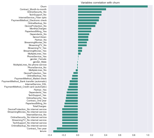
Description: From the chart, we can see the highly correlated variables with the churn. Churn is seemed to be positively correlated with month-to-month contract, absence of offline security, and the absence of tech support. The negatively correlated variables are tenure (length of time that a customer remains subscribed to the service.), customers with two year contract, and have online backups but no internet service.
1. Demographics
Let’s first undestand the personal information of our telco customers
df.head()
| customerID | gender | SeniorCitizen | Partner | Dependents | tenure | PhoneService | MultipleLines | InternetService | OnlineSecurity | ... | DeviceProtection | TechSupport | StreamingTV | StreamingMovies | Contract | PaperlessBilling | PaymentMethod | MonthlyCharges | TotalCharges | Churn | |
|---|---|---|---|---|---|---|---|---|---|---|---|---|---|---|---|---|---|---|---|---|---|
| 0 | 7590-VHVEG | Female | 0 | Yes | No | 1 | No | No phone service | DSL | No | ... | No | No | No | No | Month-to-month | Yes | Electronic check | 29.85 | 29.85 | No |
| 1 | 5575-GNVDE | Male | 0 | No | No | 34 | Yes | No | DSL | Yes | ... | Yes | No | No | No | One year | No | Mailed check | 56.95 | 1889.50 | No |
| 2 | 3668-QPYBK | Male | 0 | No | No | 2 | Yes | No | DSL | Yes | ... | No | No | No | No | Month-to-month | Yes | Mailed check | 53.85 | 108.15 | Yes |
| 3 | 7795-CFOCW | Male | 0 | No | No | 45 | No | No phone service | DSL | Yes | ... | Yes | Yes | No | No | One year | No | Bank transfer (automatic) | 42.30 | 1840.75 | No |
| 4 | 9237-HQITU | Female | 0 | No | No | 2 | Yes | No | Fiber optic | No | ... | No | No | No | No | Month-to-month | Yes | Electronic check | 70.70 | 151.65 | Yes |
5 rows × 21 columns
a) Gender distribution
fig = plt.figure(facecolor='white')
explode=[0,0.05]
ax = (df['gender'].value_counts()*100.0 /len(df))\
.plot.pie(autopct='%.1f%%', labels = ['No', 'Yes'],figsize =(5,5), fontsize = 12,colors=dual_color,shadow=True,explode=explode)
ax.yaxis.set_major_formatter(mtick.PercentFormatter())
ax.set_ylabel('Gender',fontsize = 12)
ax.set_title('% Gender Distribution', fontsize = 12)

plt.show()
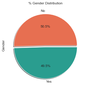
Description: From the chart, we can see that there is a very low differences between the users for both genders with a very slighlty more male users rather than females.
b) Age distribution
fig = plt.figure(facecolor='white')
explode=[0,0.1]
ax = (df['SeniorCitizen'].value_counts()*100.0 /len(df))\
.plot.pie(autopct='%.1f%%', labels = ['No', 'Yes'],figsize =(5,5), fontsize = 12,colors=dual_color,shadow=True,explode=explode)
ax.yaxis.set_major_formatter(mtick.PercentFormatter())
ax.set_ylabel('Senior Citizens',fontsize = 12)
ax.set_title('% of Senior Citizens', fontsize = 12)

plt.show()
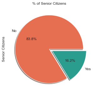
Description: The majority of the telco users are among the youger citizens with only 16.2% of the users are senior citizens.
c) Partner and dependent status
fig = plt.figure(facecolor='white')

df2 = pd.melt(df, id_vars=['customerID'], value_vars=['Dependents','Partner'])
df3 = df2.groupby(['variable','value']).count().unstack()
df3 = df3*100/len(df)
ax = df3.loc[:,'customerID'].plot.bar(stacked=True, color=dual_color,figsize=(10,5),rot = 0,width = 0.2)

ax.yaxis.set_major_formatter(mtick.PercentFormatter())
ax.set_ylabel('% Customers',size = 14)
ax.set_xlabel('')
ax.set_title('% Customers with dependents and partners',size = 14)
ax.legend(loc = 'center',prop={'size':14})


for p in ax.patches:
    width, height = p.get_width(), p.get_height()
    x, y = p.get_xy()
    ax.annotate('{:.0f}%'.format(height), (p.get_x()+.25*width, p.get_y()+.4*height),
                color = 'white',
               weight = 'bold',
               size = 14)
<Figure size 432x288 with 0 Axes>
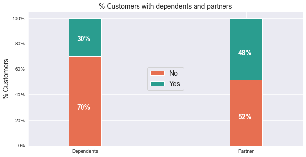
Description: Only around half of the customers have a partner, and only about a third of the overall customers have dependents.
2. Customer telco account information
Let’s first undestand the personal information of our telco customers
a) Tenure
#Get Correlation of "Churn" with other variables:

sns.displot(data=df, x="tenure",bins=int(180/5),height=5,aspect=2, color=single_color)
plt.title('Customer count by tenure')
plt.show()
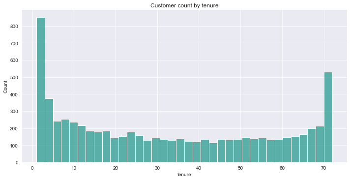
Description: Looking at the histogram above, we can see that many consumers have only been with the telco service for just a month. There are also many cusstomers use their service for over 72 months. This could be due to the fact that each customer has a different contract. As a result, depending on the contract, clients may find it simpler or more difficult to stay with or quit the telecom firm.
b) Contracts
fig = plt.figure(figsize=(10,5),facecolor='white')
sns.countplot(x="Contract", data=df,palette=triple_color)
plt.show()
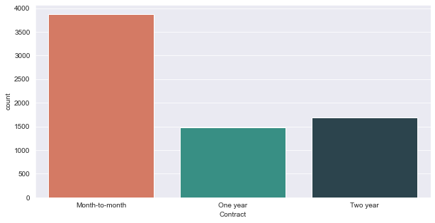
Description: As can be seen from this graph, the majority of consumers are on a month-to-month basis. The 1 year and 2 year contracts have a near equal number of consumers. Just out of curiosity, let’s see the tenure of the customers based on their contract type.
d = {'color': triple_color}
g = sns.FacetGrid(df, col="Contract",palette=triple_color,height=5, aspect=1,hue_kws=d, hue='Contract')
g.map(sns.histplot, "tenure",bins=int(180/5),color=single_color)
g.fig.subplots_adjust(top=0.8)
g.fig.suptitle('Tenure of each contracts')
plt.show()
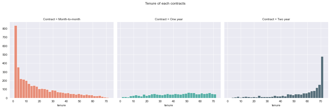
Description: Surprisingly, most monthly contracts are for 1-2 months, although two-year contracts are typically for 70 months. This demonstrates that customers who sign a lengthier contract are more loyal to the company and are more likely to stay with it for a longer time. This is also what we noticed in the churn rate correlation chart previously.
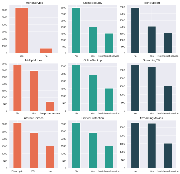
3. Distribution of customer’s telco service
Let’s see what are the services favored by the telco customers.
# View columns names to identify services
df.columns.values
array(['customerID', 'gender', 'SeniorCitizen', 'Partner', 'Dependents',
       'tenure', 'PhoneService', 'MultipleLines', 'InternetService',
       'OnlineSecurity', 'OnlineBackup', 'DeviceProtection',
       'TechSupport', 'StreamingTV', 'StreamingMovies', 'Contract',
       'PaperlessBilling', 'PaymentMethod', 'MonthlyCharges',
       'TotalCharges', 'Churn'], dtype=object)
#Create list of services
services = ['PhoneService','MultipleLines','InternetService','OnlineSecurity',\
           'OnlineBackup','DeviceProtection','TechSupport','StreamingTV','StreamingMovies']
services = ['PhoneService','MultipleLines','InternetService','OnlineSecurity',
           'OnlineBackup','DeviceProtection','TechSupport','StreamingTV','StreamingMovies']

fig, axes = plt.subplots(nrows=3,ncols=3,figsize=(12,12),facecolor='white')
for i, item in enumerate(services):
    if i < 3:
        ax = df[item].value_counts().plot(kind='bar',ax=axes[i,0],rot=0,color=triple_color[0])

    elif i >=3 and i < 6:
        ax = df[item].value_counts().plot(kind='bar',ax=axes[i-3,1],rot=0,color=triple_color[1])

    elif i < 9:
        ax = df[item].value_counts().plot(kind='bar',ax=axes[i-6,2],rot=0,color=triple_color[2])
    ax.set_title(item)
4. Correlation between monthly and total charges
fig=plt.figure(figsize=(10,5),facecolor='white')
plt.title('Correlation between monthly and total charges')
sns.scatterplot(data=df, x="MonthlyCharges", y="TotalCharges",hue='MonthlyCharges',palette=sns.dark_palette(triple_color[1], reverse=True, as_cmap=True))
plt.show()
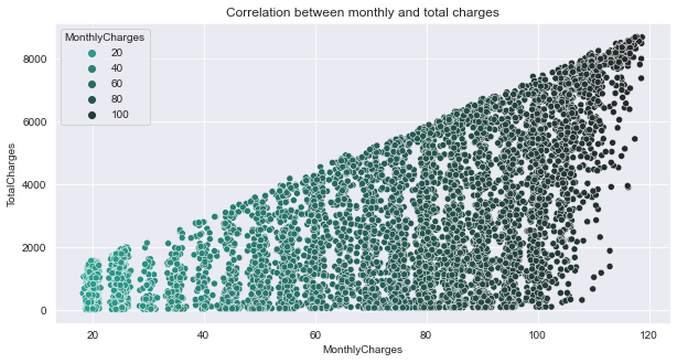
Description: From the scatterplot, the monthly bill for a customer rises as well as the total charges.
5. Churn predictor variable
a) Overall churn rate
ax = (df['Churn'].value_counts()*100.0 /len(df))\
.plot(kind='bar',
      stacked = True,
      rot = 0,color = dual_color,
      figsize = (8,6)
     )

ax.yaxis.set_major_formatter(mtick.PercentFormatter())
ax.set_ylabel('% Customers',size = 14)
ax.set_xlabel('Churn',size = 14)
ax.set_title('Overall Churn Rate', size = 14)

# create a list to collect the plt.patches data
totals = []

# find the values and append to list
for i in ax.patches:
    totals.append(i.get_width())

# set individual bar lables using above list
total = sum(totals)

for i in ax.patches:
    # get_width pulls left or right; get_y pushes up or down
    ax.text(i.get_x()+.15, i.get_height()-4.0, \
            str(round((i.get_height()/total), 1))+'%',
            fontsize=12,
            color='white',
           weight = 'bold',
           size = 14)
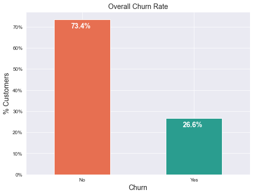
Description: From the chart, we can see that the churn rate is 26.6%. We would expect a significant majority of customers to not churn, hence the data is clearly skewed. This is wise to note during modelling because skewness might results in a lot of false negatives.
b) Churn rate by tenure, seniority, contract type, monthly charges and total charges
i) Churn vs Tenure
fig=plt.figure(figsize=(8,6),facecolor='white')
plt.title('Relationship between churn and tenure')
sns.boxplot(x = df['Churn'], y = df['tenure'],palette=dual_color)
plt.show()
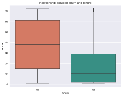
Description: Customers who do not churn, as seen in the graph below, tends to stay with the telco operator for a longer period of time.
ii) Churn by Contract Type
contract_churn = df.groupby(['Contract','Churn']).size().unstack()

ax = (contract_churn.T*100.0 / contract_churn.T.sum())\
.T.plot(kind='bar',
        width = 0.3,
        stacked = True,
        rot = 0,
        figsize = (8,6),
        color = dual_color
       )

ax.yaxis.set_major_formatter(mtick.PercentFormatter())
ax.legend(loc='best',prop={'size':14},title = 'Churn')
ax.set_ylabel('% Customers',size = 14)
ax.set_title('Relationship between churn and contract type',size = 14)

# Code to add the data labels on the stacked bar chart
for p in ax.patches:
    width, height = p.get_width(), p.get_height()
    x, y = p.get_xy()
    ax.annotate('{:.0f}%'.format(height),
                (p.get_x()+.25*width, p.get_y()+.4*height),
                color = 'white',
                weight = 'bold',
                size = 14)
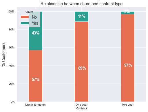
Description: The chart above shows that the telco users with month-to-month contracts tends to have higher churn rate than the other contracts. This is quite similar from the results obtain in the correlation between variables chart.
iii) Churn by Seniority
seniority_churn = df.groupby(['SeniorCitizen','Churn']).size().unstack()

ax = (seniority_churn.T*100.0 / seniority_churn.T.sum())\
.T.plot(kind='bar',
        width = 0.2,
        stacked = True,
        rot = 0,
        figsize = (8,6),
        color = dual_color
       )

ax.yaxis.set_major_formatter(mtick.PercentFormatter())
ax.legend(loc='center',prop={'size':14},title = 'Churn')
ax.set_ylabel('% Customers')
ax.set_title('Relationship between churn and seniority level',size = 14)

# Code to add the data labels on the stacked bar chart
for p in ax.patches:
    width, height = p.get_width(), p.get_height()
    x, y = p.get_xy()
    ax.annotate('{:.0f}%'.format(height),
                (p.get_x()+.25*width, p.get_y()+.4*height),
                color = 'white',
                weight = 'bold',size =14)
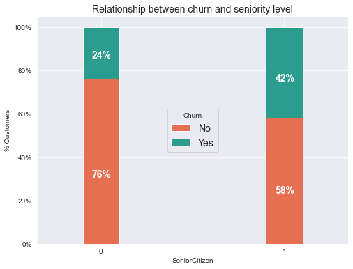
Description: The chart above shows that telco users from the senior citizens group have nearly twice the churn rate of younger citizens.
iv) Churn by Monthly Charges
fig = plt.figure(figsize=(10,5))
sns.kdeplot(df.MonthlyCharges[(df["Churn"] == 'No') ],
                color=dual_color[0],
                shade = True)

sns.kdeplot(df.MonthlyCharges[(df["Churn"] == 'Yes') ],
                color=dual_color[1],
                shade= True)

plt.legend(["Not Churn","Churn"],loc='upper right')
plt.ylabel('Density')
plt.xlabel('Monthly Charges')
plt.title('Distribution of monthly charges by churn')
plt.show()
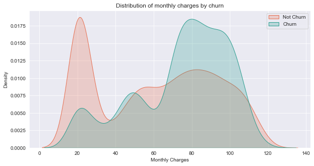
Description: From the plot above,we can observe a high churn rate when the monthly charge is high and lower when it is cheaper.
v) Churn by Total Charges
fig = plt.figure(figsize=(10,5))
sns.kdeplot(df.TotalCharges[(df["Churn"] == 'No') ],
                color=dual_color[0],
                shade = True)

sns.kdeplot(df.TotalCharges[(df["Churn"] == 'Yes') ],
                color=dual_color[1],
                shade = True)

plt.legend(["Not Churn","Churn"],loc='upper right')
plt.ylabel('Density')
plt.xlabel('Total Charges')
plt.title('Distribution of total charges by churn')
plt.show()
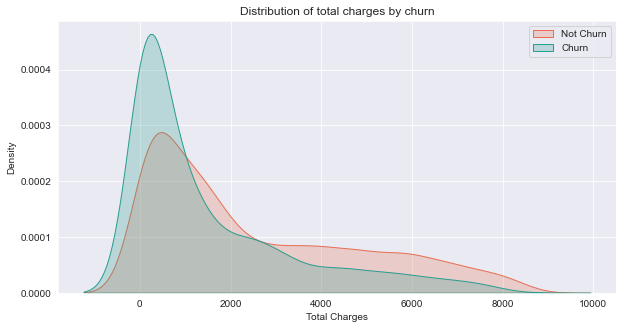
Description: The chart shows a higher chun rate on the lower values of total charges. Possibly the customers chose to pay off their bill before stopping to use the telco service.
Churn prediction model
In this section, we will create a churn prediction model using Logistic Regression, Support Vector Machine, and Random Forest.
Training
# seperate label and features
y = df_dummies.Churn
X = df_dummies.drop('Churn', axis=1)
From the dataset, we can see large differences between their ranges for each columns. These differences in the ranges of initial features causes trouble to many machine learning models. Here, we will use MinMax scaler to scale all variables from 0 to 1.
# Scaling all the variables to a range of 0 to 1
from sklearn.preprocessing import MinMaxScaler, StandardScaler
features = X.columns.values
scaler = StandardScaler()
scaler.fit(X)
X = pd.DataFrame(scaler.transform(X))
X.columns = features
# Split the data into training and testing sets
from sklearn.model_selection import train_test_split
X_train, X_test, y_train, y_test = train_test_split(X, y, test_size=0.2, random_state=123)
We know from out EDA that the data is skewed causing an imbalance. We can oversample the minority class using SMOTE. This is done to avoid a lot of false positives from occuring.
# oversampling the data
from imblearn.over_sampling import SMOTE

oversample = SMOTE()
X, y = oversample.fit_resample(X, y)
# Split the oversampled data into training and testing sets
from sklearn.model_selection import train_test_split
X_train, X_test, y_train, y_test = train_test_split(X, y, test_size=0.2, random_state=123)
y_train.value_counts()
0    4132
1    4128
Name: Churn, dtype: int64
# Import the models
from sklearn.linear_model import LogisticRegression
from sklearn.svm import SVC
from sklearn.ensemble import RandomForestClassifier
from sklearn.neural_network import MLPClassifier
#Logistic Regression model
lr_model=LogisticRegression(C=10).fit(X_train,y_train)

#Support Vector Machine
svm_model=SVC(C=1.5,kernel='linear').fit(X_train,y_train)

# Neural Network
from sklearn.neural_network import MLPClassifier
nn_model=MLPClassifier(activation='logistic',
                       alpha=0.009,
                       validation_fraction=0.2).fit(X_train,y_train)

#print model scores
print('Logistic Regression Accuracy: {:.2f}%'.format(lr_model.score(X_test,y_test)*100))
print('Support Vector Machine Accuracy: {:.2f}%'.format(svm_model.score(X_test,y_test)*100))
print('Neural Network Accuracy: {:.2f}%'.format(nn_model.score(X_test,y_test)*100))
C:\Users\Haziq\Anaconda3\lib\site-packages\sklearn\neural_network\_multilayer_perceptron.py:582: ConvergenceWarning: Stochastic Optimizer: Maximum iterations (200) reached and the optimization hasn't converged yet.
  warnings.warn(


Logistic Regression Accuracy: 78.17%
Support Vector Machine Accuracy: 77.15%
Neural Network Accuracy: 79.62%
from sklearn.metrics import f1_score as f1
#make predictions
lr_pred = lr_model.predict(X_test)
svm_pred = svm_model.predict(X_test)
nn_pred = nn_model.predict(X_test)

#Print model's prediction f1 score
print('Logistic Regression Accuracy: {:.2f}%'.format(f1(y_test, lr_pred)*100))
print('Support Vector Machine Accuracy: {:.2f}%'.format(f1(y_test, svm_pred)*100))
print('Neural Network Accuracy: {:.2f}%'.format(f1(y_test, nn_pred)*100))
Logistic Regression Accuracy: 79.11%
Support Vector Machine Accuracy: 78.27%
Neural Network Accuracy: 80.48%
Evaluation
import numpy as np
import seaborn as sns
from sklearn.metrics import confusion_matrix
fig, axs = plt.subplots(nrows=1,ncols=3)
fig.set_size_inches(15, 4)

lr_cmat = confusion_matrix(y_test,lr_pred)
svm_cmat = confusion_matrix(y_test,svm_pred)
nn_cmat = confusion_matrix(y_test,nn_pred)

fig.suptitle("Prediction Model Confusion Matrix")

sns.heatmap(lr_cmat,annot=True,ax=axs[0],cmap=sns.dark_palette(triple_color[0]))
axs[0].set_title('Logistic Regression')
axs[0].set_xlabel('Actual')
axs[0].set_ylabel('Predicted')

sns.heatmap(svm_cmat,annot=True,ax=axs[1],cmap=sns.dark_palette(triple_color[0]))
axs[1].set_title('Support Vector machine')
axs[1].set_xlabel('Actual')
axs[1].set_ylabel('Predicted')

sns.heatmap(nn_cmat,annot=True,ax=axs[2],cmap=sns.dark_palette(triple_color[0]))
axs[2].set_title('Neural Network')
axs[2].set_xlabel('Actual')
axs[2].set_ylabel('Predicted')

plt.show()
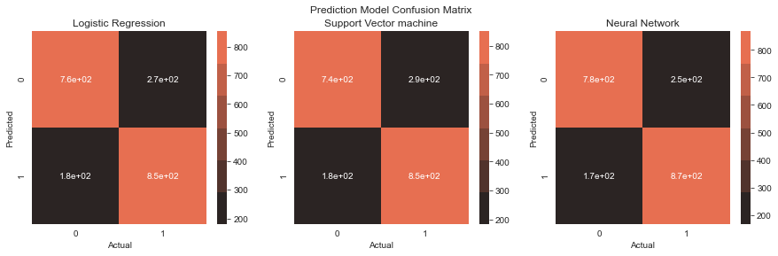
Description: From the confusion matrix, there are some false positives albeit significantly lower. I’ve made another churn prediction model before this one and the false positives are way to high.
from sklearn.metrics import classification_report

true = y_test
target_names = list(['no churn','churn'])

lr_clf_report = classification_report(true,
                                   lr_pred,
                                   target_names=target_names,
                                   output_dict=True)

svm_clf_report = classification_report(true,
                                   svm_pred,
                                   target_names=target_names,
                                   output_dict=True)

nn_clf_report = classification_report(true,
                                   nn_pred,
                                   target_names=target_names,
                                   output_dict=True)
fig, axs = plt.subplots(1,3)
fig.set_size_inches(15, 5)

fig.suptitle("Prediction Model Classification Report")

sns.heatmap(pd.DataFrame(lr_clf_report).iloc[:-1, :].T, annot=True,ax=axs[0],cmap=sns.dark_palette(triple_color[1]))
axs[0].set_title('Logistic Regression')
axs[0].tick_params(labelrotation=45,axis='y')


sns.heatmap(pd.DataFrame(svm_clf_report).iloc[:-1, :].T, annot=True,ax=axs[1],cmap=sns.dark_palette(triple_color[1]))
axs[1].set_title('Support Vector machine')
axs[1].tick_params(labelrotation=45,axis='y')


sns.heatmap(pd.DataFrame(nn_clf_report).iloc[:-1, :].T, annot=True,ax=axs[2],cmap=sns.dark_palette(triple_color[1]))
axs[2].set_title('Neural Network')
axs[2].tick_params(labelrotation=45,axis='y')

plt.show()
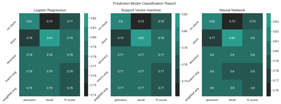
Description: At a glance, we can see that our Support Vector Machine model works better than the other two models by having better scores overall.
fig = plt.figure(figsize=(8,5))
weights = pd.Series(svm_model.coef_[0],
                 index=X.columns.values)[:20]

head = weights.sort_values(ascending=False)

sns.barplot(head.values, head.index,color=single_color)
plt.title("SVM model's feature importance")
plt.show()
C:\Users\Haziq\Anaconda3\lib\site-packages\seaborn\_decorators.py:36: FutureWarning: Pass the following variables as keyword args: x, y. From version 0.12, the only valid positional argument will be `data`, and passing other arguments without an explicit keyword will result in an error or misinterpretation.
  warnings.warn(
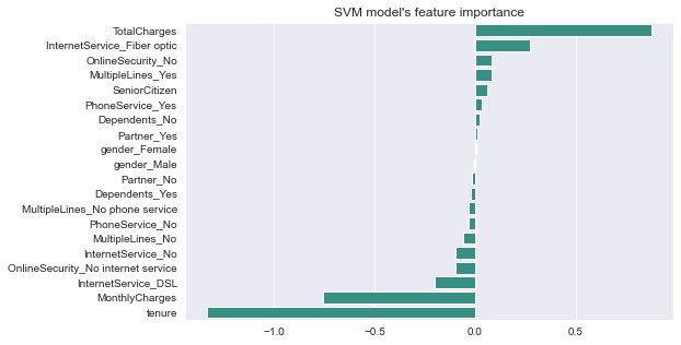
Description: Some variables have a negative relationship with our anticipated variable (Churn), whereas others have a positive relationship. A negative relationship indicates that the likelihood of churn decreases as the variable is increased. Let’s have a look at some of the more intriguing features:
-
The thing I found interesting is that telco users with Fiber Optic internet service are more likely to churn rather than DSL. This is intriguing because, despite the fact that fibre optic services are quicker, customers are more likely to churn as a result. I believe we need to go deeper to understand why this is happening.
-
Quite similar to our correaltion between variables plot in our EDA, we can see that tenure and two year contracts, and monthly charges contributed to lower rates of churn. Having longer contracts possibly cause increased loyalty from the telco customers. Monthly charges cause lower churn rates possibly the telco users are in a country where salary are mostly given monthly and they have less stress when paying telco bills since they currently have money for it.