
1. Questions
This analysis will try to answer the following questions:
- What factor that most likely to cause an increases in the number of new cases?
- How Covid-19 affects differently in different states?
- When will we achieve herd immunity?
- Will new cases increases or decrease next month?
2. Measurement Priorities
- Correlation between each factor in the dataset using correlation matrix.
- The difference in the count of new cases and in the states.
- Percentage of fully vaccinated individuals angainst the total population.
- Number of forecasted new cases in the next 30 days using time series forecasting.
3. Data Collection
- Source
- For this analysis, we will make use of the dataset from The Ministry of Health Malaysia GitHub page.
- Since they don’t provide data for vaccinations, we will obtain the data from other sources which in this case is from Our World in Data.
- These sites frequently updates these data values, we will use programmatically automate this data collection process each time we restart the notebook
- Storage
- The data collected from the sites will bw stored as a CSV file in the /dataset directory.
- This allows the data can still be analysed localy when connectivity problems persists.
Github link for project
Notebook contents:
- Factors that correlates to the number of new cases
- Vaccination
- Count of new cases by state
- Count of Covid tests by state
Importing the data
Since the data is frequently updated, we will grab the data directly from the site instead of having to download the csv files manually to perform the analysis. The other good part about this is that the analysis done in on the latest data provided.
Datasets are obtained from:
import pandas as pd
import numpy as np
import io
import requests
url="https://raw.githubusercontent.com/MoH-Malaysia/covid19-public/main/epidemic/tests_malaysia.csv"
s=requests.get(url).content
tests=pd.read_csv(io.StringIO(s.decode('utf-8')))
tests.to_csv('dataset/tests_malaysia.csv')
url="https://raw.githubusercontent.com/MoH-Malaysia/covid19-public/main/epidemic/cases_malaysia.csv"
s=requests.get(url).content
cases=pd.read_csv(io.StringIO(s.decode('utf-8')))
cases.to_csv('dataset/cases_malaysia.csv')
url="https://raw.githubusercontent.com/MoH-Malaysia/covid19-public/main/epidemic/cases_state.csv"
s=requests.get(url).content
state_cases=pd.read_csv(io.StringIO(s.decode('utf-8')))
state_cases.to_csv('dataset/cases_state.csv')
url="https://raw.githubusercontent.com/MoH-Malaysia/covid19-public/main/mysejahtera/trace_malaysia.csv"
s=requests.get(url).content
casual_contacts=pd.read_csv(io.StringIO(s.decode('utf-8')))
casual_contacts.to_csv('dataset/trace_malaysia.csv')
url="https://raw.githubusercontent.com/MoH-Malaysia/covid19-public/main/epidemic/deaths_malaysia.csv"
s=requests.get(url).content
deaths_public=pd.read_csv(io.StringIO(s.decode('utf-8')))
deaths_public.to_csv('dataset/deaths_malaysia.csv')
url="https://raw.githubusercontent.com/MoH-Malaysia/covid19-public/main/epidemic/deaths_state.csv"
s=requests.get(url).content
deaths_state=pd.read_csv(io.StringIO(s.decode('utf-8')))
deaths_state.to_csv('dataset/death_state.csv')
url="https://raw.githubusercontent.com/owid/covid-19-data/master/public/data/vaccinations/vaccinations.csv"
s=requests.get(url).content
vaccination_who=pd.read_csv(io.StringIO(s.decode('utf-8')))
vaccination_who.to_csv('dataset/vaccinations.csv')
url="https://raw.githubusercontent.com/MoH-Malaysia/covid19-public/main/epidemic/tests_state.csv"
s=requests.get(url).content
tests_state=pd.read_csv(io.StringIO(s.decode('utf-8')))
tests_state.to_csv('dataset/tests_state.csv')
url='https://raw.githubusercontent.com/MoH-Malaysia/covid19-public/main/static/population.csv'
s=requests.get(url).content
population=pd.read_csv(io.StringIO(s.decode('utf-8')))
population.to_csv('dataset/population.csv')
EDA
1. Factors that correlates to the number of new cases
Data cleaning
#make backup of the original dataframe
df_tests=tests.copy()
df_cases=cases.copy()
df_death_public=deaths_public.copy()
df_casual_contacts=casual_contacts.copy()
#preview data
df_cases.tail()
| date | cases_new | cases_import | cases_recovered | cluster_import | cluster_religious | cluster_community | cluster_highRisk | cluster_education | cluster_detentionCentre | cluster_workplace | |
|---|---|---|---|---|---|---|---|---|---|---|---|
| 604 | 2021-09-20 | 14345 | 43 | 16814 | 24.0 | 4.0 | 447.0 | 7.0 | 1.0 | 10.0 | 523.0 |
| 605 | 2021-09-21 | 15759 | 27 | 16650 | 0.0 | 3.0 | 301.0 | 45.0 | 15.0 | 2.0 | 622.0 |
| 606 | 2021-09-22 | 14990 | 5 | 19702 | 0.0 | 8.0 | 210.0 | 35.0 | 49.0 | 17.0 | 595.0 |
| 607 | 2021-09-23 | 13754 | 4 | 16628 | 0.0 | 1.0 | 303.0 | 20.0 | 7.0 | 6.0 | 658.0 |
| 608 | 2021-09-24 | 14554 | 9 | 16751 | 0.0 | 0.0 | 405.0 | 45.0 | 34.0 | 4.0 | 582.0 |
#check for null values
print(df_tests.isna().sum())
print('\n')
print(df_cases.isna().sum())
print('\n')
print(df_casual_contacts.isna().sum())
print('\n')
print(df_death_public.isna().sum())
date      0
rtk-ag    0
pcr       0
dtype: int64


date                         0
cases_new                    0
cases_import                 0
cases_recovered              0
cluster_import             342
cluster_religious          342
cluster_community          342
cluster_highRisk           342
cluster_education          342
cluster_detentionCentre    342
cluster_workplace          342
dtype: int64


date                0
casual_contacts     0
hide_large         50
hide_small         50
dtype: int64


date              0
deaths_new        0
deaths_new_dod    0
deaths_bid        0
deaths_bid_dod    0
dtype: int64
#check data types
print(df_tests.dtypes)
print('\n')
print(df_cases.dtypes)
print('\n')
print(df_casual_contacts.dtypes)
print('\n')
print(df_death_public.dtypes)
date      object
rtk-ag     int64
pcr        int64
dtype: object


date                        object
cases_new                    int64
cases_import                 int64
cases_recovered              int64
cluster_import             float64
cluster_religious          float64
cluster_community          float64
cluster_highRisk           float64
cluster_education          float64
cluster_detentionCentre    float64
cluster_workplace          float64
dtype: object


date                object
casual_contacts      int64
hide_large         float64
hide_small         float64
dtype: object


date              object
deaths_new         int64
deaths_new_dod     int64
deaths_bid         int64
deaths_bid_dod     int64
dtype: object
#convert date column into datetime
df_tests['date'] = pd.to_datetime(df_tests['date'])
df_cases['date'] = pd.to_datetime(df_cases['date'])
df_casual_contacts['date'] = pd.to_datetime(df_casual_contacts['date'])
df_death_public['date'] = pd.to_datetime(df_cases['date'])
#create dataframe with selected columns
df_cases_new=df_cases[['date','cases_new']]
df_casual_contacts=df_casual_contacts[['date','casual_contacts']]
df_death_total=df_death_public[['date','deaths_new']]
#merge dataframes
new_cases_and_tests =pd.merge(df_cases_new,df_tests,on="date", how='right')
test_cases_contacts =pd.merge(new_cases_and_tests,df_casual_contacts,on="date",how='left')
df_merged =pd.merge(test_cases_contacts,df_death_total,on="date",how='left')
#preview merged dataframe
df_merged.tail()
| date | cases_new | rtk-ag | pcr | casual_contacts | deaths_new | |
|---|---|---|---|---|---|---|
| 603 | 2021-09-18 | 15549.0 | 53716 | 51101 | 35972.0 | NaN |
| 604 | 2021-09-19 | 14954.0 | 70816 | 38498 | 35812.0 | NaN |
| 605 | 2021-09-20 | 14345.0 | 120160 | 45337 | 44788.0 | NaN |
| 606 | 2021-09-21 | 15759.0 | 110875 | 52789 | 41393.0 | NaN |
| 607 | 2021-09-22 | 14990.0 | 127625 | 48687 | 44965.0 | NaN |
#check for null values
df_merged.isna().sum()
date                 0
cases_new            1
rtk-ag               0
pcr                  0
casual_contacts    402
deaths_new          51
dtype: int64
#handling null values
#Since theres a substantial amount of missing values,
#we will use iterative imputer. It will estimate the values according to the featues.

from sklearn.experimental import enable_iterative_imputer
from sklearn.impute import IterativeImputer
from sklearn.linear_model import LinearRegression
x=df_merged[['cases_new','casual_contacts','pcr','rtk-ag','deaths_new']]

it_imputer = IterativeImputer(min_value = 0)
y=it_imputer.fit_transform(x)

y = pd.DataFrame(y, columns = x.columns)
pd.DataFrame(y)

cleaned_df =pd.merge(y,df_merged['date'], left_index=True, right_index=True)

pd.DataFrame(cleaned_df)
| cases_new | casual_contacts | pcr | rtk-ag | deaths_new | date | |
|---|---|---|---|---|---|---|
| 0 | 0.0 | 708.061210 | 2.0 | 0.0 | 0.000000 | 2020-01-24 |
| 1 | 4.0 | 713.251588 | 5.0 | 0.0 | 2.000000 | 2020-01-25 |
| 2 | 0.0 | 710.942841 | 14.0 | 0.0 | 0.000000 | 2020-01-26 |
| 3 | 0.0 | 713.344200 | 24.0 | 0.0 | 0.000000 | 2020-01-27 |
| 4 | 0.0 | 720.222053 | 53.0 | 0.0 | 1.000000 | 2020-01-28 |
| ... | ... | ... | ... | ... | ... | ... |
| 603 | 15549.0 | 35972.000000 | 51101.0 | 53716.0 | 408.310762 | 2021-09-18 |
| 604 | 14954.0 | 35812.000000 | 38498.0 | 70816.0 | 383.149210 | 2021-09-19 |
| 605 | 14345.0 | 44788.000000 | 45337.0 | 120160.0 | 336.497232 | 2021-09-20 |
| 606 | 15759.0 | 41393.000000 | 52789.0 | 110875.0 | 386.767446 | 2021-09-21 |
| 607 | 14990.0 | 44965.000000 | 48687.0 | 127625.0 | 353.002695 | 2021-09-22 |
608 rows × 6 columns
#convert numerical values to integer
cleaned_df[['cases_new','casual_contacts','pcr', 'rtk-ag','deaths_new']]=cleaned_df[['cases_new','casual_contacts','pcr', 'rtk-ag','deaths_new']].astype(int)
#sort values by date
cleaned_df.sort_values(by='date',ascending=True)
| cases_new | casual_contacts | pcr | rtk-ag | deaths_new | date | |
|---|---|---|---|---|---|---|
| 0 | 0 | 708 | 2 | 0 | 0 | 2020-01-24 |
| 1 | 4 | 713 | 5 | 0 | 2 | 2020-01-25 |
| 2 | 0 | 710 | 14 | 0 | 0 | 2020-01-26 |
| 3 | 0 | 713 | 24 | 0 | 0 | 2020-01-27 |
| 4 | 0 | 720 | 53 | 0 | 1 | 2020-01-28 |
| ... | ... | ... | ... | ... | ... | ... |
| 603 | 15549 | 35972 | 51101 | 53716 | 408 | 2021-09-18 |
| 604 | 14954 | 35812 | 38498 | 70816 | 383 | 2021-09-19 |
| 605 | 14345 | 44788 | 45337 | 120160 | 336 | 2021-09-20 |
| 606 | 15759 | 41393 | 52789 | 110875 | 386 | 2021-09-21 |
| 607 | 14990 | 44965 | 48687 | 127625 | 353 | 2021-09-22 |
608 rows × 6 columns
Visualization
import seaborn as sns
import matplotlib.pyplot as plt

sns.set_style("darkgrid")
Correlation between variables
#plot correlation heatmap
corr=cleaned_df.corr()
plt.figure(figsize=(8,8))

sns.heatmap(corr,annot=True,vmin=-1.0, cmap='mako')
plt.title('Correlation Heatmap')
plt.show()
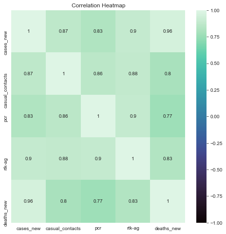
Description: From the correlation matrix, we can see that there is a high positive correlation between death and new cases. This shows that as the count of new cases increase, the reported new death cases also increases. The amount of new cases is also have a high correlation with the amount of testing done. Among the two tests, rtk-ag test have a higher correlation coefficient than pcr. This may show that there are more positive cases reported by rtk-ag in comparison with pcr. Casual contacts also have a high correlation to the amount of new cases. This shows that casual contacts contributes to the amount of new covid cases.
Dataset variables value over time
#plot multiple line graph
fig=plt.figure(figsize=(14,8))
plt.title('Dataset variables value over time')
plt.xticks(rotation=0)
sns.lineplot(data=pd.melt(cleaned_df, 'date'), x="date", y='value',hue='variable',palette='husl')
plt.legend()

plt.xlabel('Date')
plt.ylabel('Count')

plt.show()
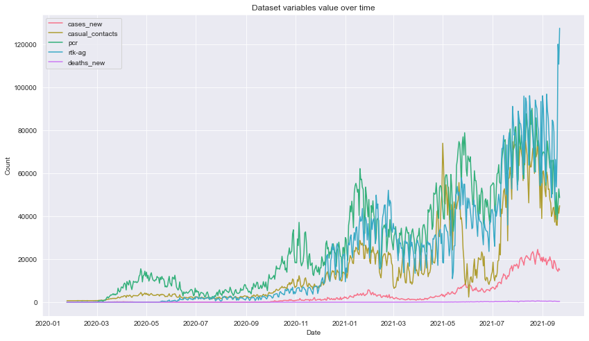
Description: From the plot, we can see that the variables are having an upward trend as time progress. Notice the presence some occasional dips in the number of casual contacts everytime cases hits an all new time high which possibly due to the implementation of stricter Movement Control Order where people are refrained from travelling and even going out. This can be further seen on the filtered linegraph below.
#plot multiple line graph
fig=plt.figure(figsize=(14,8))
plt.title('Casual contacts and new cases ')
plt.xticks(rotation=0)

colors = ["#FF0B04", "#4374B3"]


sns.lineplot(data=pd.melt(cleaned_df[['cases_new','casual_contacts','date']], 'date'),
             x="date",
             y='value',
             hue='variable',
             palette=colors
            )

plt.xlabel('Date')
plt.ylabel('Count')

plt.show()
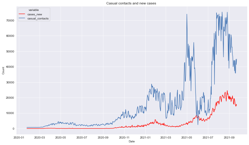
Description: Here we can have a clearer view on the occasional dips in the number of casual contacts everytime cases hits an all new time high as mentioned from the previous description.
2. Vaccination
Based on the government’s target, we need to have 80% of the population fully vaccinated against Covid-19 in order to achieve herd immunity.
Data cleaning
#make a backup of the dataframe
df_vaccination = vaccination_who.copy()
df_population = population.copy()
#preview the dataframe
df_vaccination.head()
| location | iso_code | date | total_vaccinations | people_vaccinated | people_fully_vaccinated | total_boosters | daily_vaccinations_raw | daily_vaccinations | total_vaccinations_per_hundred | people_vaccinated_per_hundred | people_fully_vaccinated_per_hundred | total_boosters_per_hundred | daily_vaccinations_per_million | |
|---|---|---|---|---|---|---|---|---|---|---|---|---|---|---|
| 0 | Afghanistan | AFG | 2021-02-22 | 0.0 | 0.0 | NaN | NaN | NaN | NaN | 0.0 | 0.0 | NaN | NaN | NaN |
| 1 | Afghanistan | AFG | 2021-02-23 | NaN | NaN | NaN | NaN | NaN | 1367.0 | NaN | NaN | NaN | NaN | 34.0 |
| 2 | Afghanistan | AFG | 2021-02-24 | NaN | NaN | NaN | NaN | NaN | 1367.0 | NaN | NaN | NaN | NaN | 34.0 |
| 3 | Afghanistan | AFG | 2021-02-25 | NaN | NaN | NaN | NaN | NaN | 1367.0 | NaN | NaN | NaN | NaN | 34.0 |
| 4 | Afghanistan | AFG | 2021-02-26 | NaN | NaN | NaN | NaN | NaN | 1367.0 | NaN | NaN | NaN | NaN | 34.0 |
#preview the dataframe
df_population.head()
| state | idxs | pop | pop_18 | pop_60 | pop_12 | |
|---|---|---|---|---|---|---|
| 0 | Malaysia | 0 | 32657400 | 23409600 | 3502000 | 3147500 |
| 1 | Johor | 1 | 3781000 | 2711900 | 428700 | 359900 |
| 2 | Kedah | 2 | 2185100 | 1540600 | 272500 | 211400 |
| 3 | Kelantan | 3 | 1906700 | 1236200 | 194100 | 210600 |
| 4 | Melaka | 4 | 932700 | 677400 | 118500 | 86500 |
#filter column and rows with data for Malaysia
df_population = df_population[df_population['state']=='Malaysia']
df_vaccination = df_vaccination[df_vaccination['iso_code'] =='MYS']
#create new dataframe with selected columns
df_vax_col = df_vaccination[['date', 'total_vaccinations', 'people_vaccinated' , 'people_fully_vaccinated','daily_vaccinations']]
#convert date column to datetime
df_vax_col['date'] = pd.to_datetime(df_vax_col['date'])
<ipython-input-32-087e617b6292>:2: SettingWithCopyWarning:
A value is trying to be set on a copy of a slice from a DataFrame.
Try using .loc[row_indexer,col_indexer] = value instead

See the caveats in the documentation: https://pandas.pydata.org/pandas-docs/stable/user_guide/indexing.html#returning-a-view-versus-a-copy
  df_vax_col['date'] = pd.to_datetime(df_vax_col['date'])
#check for null values
print(df_vax_col.isna().sum())
date                       0
total_vaccinations         0
people_vaccinated          0
people_fully_vaccinated    2
daily_vaccinations         1
dtype: int64
#drop null rows
df_vax_col.dropna(inplace=True)
<ipython-input-34-ef025bb1d682>:2: SettingWithCopyWarning:
A value is trying to be set on a copy of a slice from a DataFrame

See the caveats in the documentation: https://pandas.pydata.org/pandas-docs/stable/user_guide/indexing.html#returning-a-view-versus-a-copy
  df_vax_col.dropna(inplace=True)
#preview dataframe
df_vax_col.tail()
| date | total_vaccinations | people_vaccinated | people_fully_vaccinated | daily_vaccinations | |
|---|---|---|---|---|---|
| 27655 | 2021-09-19 | 40375056.0 | 22003333.0 | 18453322.0 | 230267.0 |
| 27656 | 2021-09-20 | 40664674.0 | 22099719.0 | 18648795.0 | 239191.0 |
| 27657 | 2021-09-21 | 40925929.0 | 22226325.0 | 18786636.0 | 241660.0 |
| 27658 | 2021-09-22 | 41247271.0 | 22351561.0 | 18986347.0 | 252022.0 |
| 27659 | 2021-09-23 | 41573883.0 | 22482988.0 | 19180397.0 | 269781.0 |
Visualization
#create pandas series from column
df_pop = df_population['pop']
#merge dataframes
df_vax_herd = df_vax_col.merge(df_pop, how='cross')
#preview dataframes
df_vax_col.tail()
| date | total_vaccinations | people_vaccinated | people_fully_vaccinated | daily_vaccinations | |
|---|---|---|---|---|---|
| 27655 | 2021-09-19 | 40375056.0 | 22003333.0 | 18453322.0 | 230267.0 |
| 27656 | 2021-09-20 | 40664674.0 | 22099719.0 | 18648795.0 | 239191.0 |
| 27657 | 2021-09-21 | 40925929.0 | 22226325.0 | 18786636.0 | 241660.0 |
| 27658 | 2021-09-22 | 41247271.0 | 22351561.0 | 18986347.0 | 252022.0 |
| 27659 | 2021-09-23 | 41573883.0 | 22482988.0 | 19180397.0 | 269781.0 |
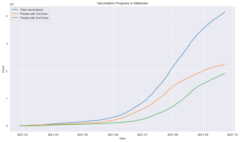
Plot of vaccination progress in Malaysia
#plot multiple line graph
fig=plt.figure(figsize=(14,8))

date = df_vax_herd['date']
sns.lineplot(x=date, y=df_vax_herd['total_vaccinations'], label = "Total vaccinations")
sns.lineplot(x=date, y=df_vax_herd['people_vaccinated'], label = "People with 1st Dose")
sns.lineplot(x=date, y=df_vax_herd['people_fully_vaccinated'], label = "People with 2nd Dose")

plt.title('Vaccination Progress in Malaysia')

plt.xlabel('Date')
plt.ylabel('Count')

plt.show()
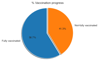
Percentage of fully vaccinated count against population
#calculate current herd immunity percentage
vax_pop = (df_vax_herd['people_fully_vaccinated'].iloc[-1:,] / df_vax_herd['pop'].iloc[-1:,]) * 100
#plot pie chart
import matplotlib.ticker as mtick

np_vax=(100-vax_pop)
a =float(vax_pop)
b =float(np_vax)
explode = [0.0,0.05]
labels = 'Fully vaccinated', 'Not-fully vaccinated'
sizes = [a,b]

fig1, ax1 = plt.subplots()
ax1.pie(sizes, explode=explode, labels=labels, autopct='%1.1f%%',
        shadow=True, startangle=90)
ax1.yaxis.set_major_formatter(mtick.PercentFormatter())
ax1.axis('equal')

ax1.set_title('% Vaccination progress')

plt.show()
Percentage of fully vaccinated count across time
#calculate herd immunity percentage
df_vax_herd['vax_percentage'] = (df_vax_herd['people_fully_vaccinated'] / df_vax_herd['pop']) * 100
#plot line graph
fig=plt.figure(figsize=(14,8))

sns.lineplot(data=df_vax_herd,x=df_vax_herd['date'],y=df_vax_herd['vax_percentage'])
plt.title("Covid-19 Herd Immunity Progress in Malaysia")
plt.xlabel("Date")
plt.ylabel("Percentage")
plt.show()
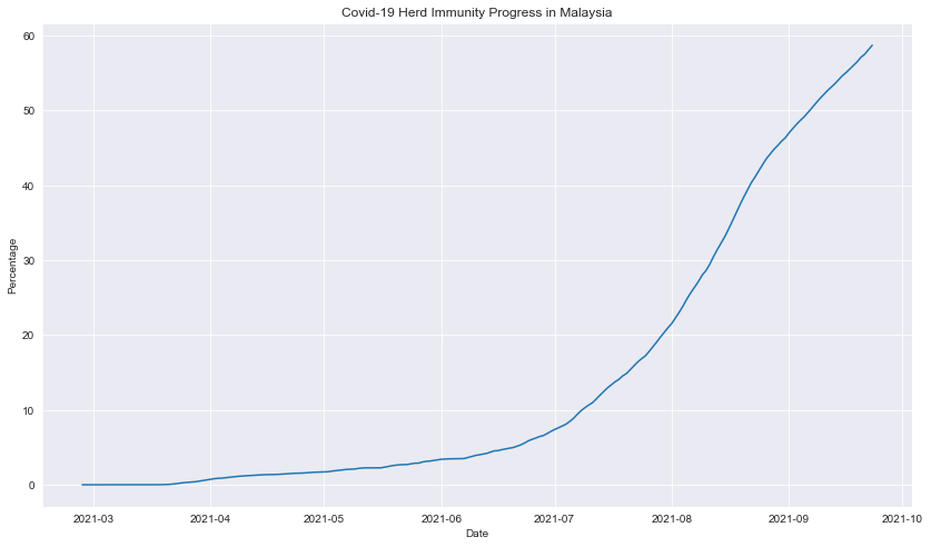
Description: The vaccine admnistration had exponentially increased with a slight decreased rate aproaching September 2021.
3. Count of new cases by state
Data Cleaning
#create a copy of the original datafarme
df_state_cases=state_cases.copy()
df_death_public=deaths_public.copy()
df_death_state=deaths_state.copy()
#preview dataframe
df_state_cases.head()
| date | state | cases_import | cases_new | cases_recovered | |
|---|---|---|---|---|---|
| 0 | 2020-01-25 | Johor | 4 | 4 | 0 |
| 1 | 2020-01-25 | Kedah | 0 | 0 | 0 |
| 2 | 2020-01-25 | Kelantan | 0 | 0 | 0 |
| 3 | 2020-01-25 | Melaka | 0 | 0 | 0 |
| 4 | 2020-01-25 | Negeri Sembilan | 0 | 0 | 0 |
#convert date to datetime
df_state_cases['date'] = pd.to_datetime(df_state_cases['date'])
df_death_public['date'] = pd.to_datetime(df_death_public['date'])
df_death_state['date'] = pd.to_datetime(df_death_state['date'])
#check for null values
df_state_cases.isna().sum()
date               0
state              0
cases_import       0
cases_new          0
cases_recovered    0
dtype: int64
Visualization
Plot of new cases for each state over time
#scatter plot values over time
fig=plt.figure(figsize=(14,8))
plt.title("Covid cases according to state")

sns.scatterplot(y='cases_new', x='date',hue='state',size="state",data=df_state_cases)

plt.xlabel('Date')
plt.ylabel('Count of new cases')

plt.show()
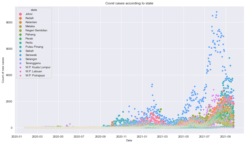
Description: The plot shows that Selangor had significatly more cases throughout the time.Around April 2021, there is a low dip after the second ATH that occured around February 2021, and continued to increase exponantially going forward until August before droping to lower count of new cases.
4. Count of Covid tests by state
Data cleaning
#make a copy of the dataframe
df_tests_state = tests_state.copy()
#create sum of tests by state
df_ts = df_tests_state.groupby(['state']).sum()
#reset index
df_ts.reset_index(inplace=True)
#create new column with sum of both testing values
df_ts['total_test'] = (df_ts['rtk-ag'] + df_ts['pcr'])
Visualization
Plot of total Covid tests by state
#plot bar chart
fig=plt.figure(figsize=(14,8))
plt.title("Covid Tests by State")
sns.barplot(x="state", y="total_test", data=df_ts)
plt.xlabel('State')
plt.ylabel('Sum of Covid Tests')
plt.xticks(rotation=45)
plt.show()
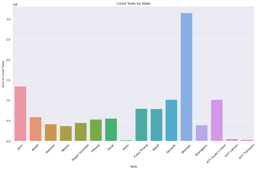
Description: From the Covid Tests by State plot, we can see the top 3 states that have run the most test are Selangor, Johor, and, Sarawak. Despite being near to the Selangor state, W.P Putrajaya had significatly fewer tests done in the area.
Covid-19 new cases forecast
Data preparation
#Prophet Dependencies
#!pip install pystan==2.19.1.1
#!pip install prophet
#if unable to install
#conda install --override-channels -c main -c conda-forge boost
#import prophet
from prophet import Prophet
Importing plotly failed. Interactive plots will not work.
#make a copy of the original dataframe
pdf = df_cases.copy()
pdf.tail()
| date | cases_new | cases_import | cases_recovered | cluster_import | cluster_religious | cluster_community | cluster_highRisk | cluster_education | cluster_detentionCentre | cluster_workplace | |
|---|---|---|---|---|---|---|---|---|---|---|---|
| 604 | 2021-09-20 | 14345 | 43 | 16814 | 24.0 | 4.0 | 447.0 | 7.0 | 1.0 | 10.0 | 523.0 |
| 605 | 2021-09-21 | 15759 | 27 | 16650 | 0.0 | 3.0 | 301.0 | 45.0 | 15.0 | 2.0 | 622.0 |
| 606 | 2021-09-22 | 14990 | 5 | 19702 | 0.0 | 8.0 | 210.0 | 35.0 | 49.0 | 17.0 | 595.0 |
| 607 | 2021-09-23 | 13754 | 4 | 16628 | 0.0 | 1.0 | 303.0 | 20.0 | 7.0 | 6.0 | 658.0 |
| 608 | 2021-09-24 | 14554 | 9 | 16751 | 0.0 | 0.0 | 405.0 | 45.0 | 34.0 | 4.0 | 582.0 |
#check data types of the dataframe columns
pdf.dtypes
date                       datetime64[ns]
cases_new                           int64
cases_import                        int64
cases_recovered                     int64
cluster_import                    float64
cluster_religious                 float64
cluster_community                 float64
cluster_highRisk                  float64
cluster_education                 float64
cluster_detentionCentre           float64
cluster_workplace                 float64
dtype: object
#create y and ds dataframe
pdf=pdf[['cases_new','date']]
pdf.columns = ['y', 'ds']
#preview the dataframe
pdf.tail()
| y | ds | |
|---|---|---|
| 604 | 14345 | 2021-09-20 |
| 605 | 15759 | 2021-09-21 |
| 606 | 14990 | 2021-09-22 |
| 607 | 13754 | 2021-09-23 |
| 608 | 14554 | 2021-09-24 |
Hyperparameter tuning
#hyperparameter tuning

import itertools
from prophet.diagnostics import cross_validation
from prophet.diagnostics import performance_metrics


#cutoffs = pd.to_datetime(['2013-02-15', '2013-08-15', '2014-02-15'])

param_grid = {
    'changepoint_prior_scale': [0.001, 0.01, 0.1, 0.5],
    'seasonality_prior_scale': [0.01, 0.1, 1.0, 10.0],
}

# Generate all combinations of parameters
all_params = [dict(zip(param_grid.keys(), v)) for v in itertools.product(*param_grid.values())]
rmses = []  # Store the RMSEs for each params here

# Use cross validation to evaluate all parameters
for params in all_params:
    m = Prophet(**params).fit(pdf)  # Fit model with given params
    df_cv = cross_validation(m, initial='467 days', horizon='90 days', parallel="processes")
    df_p = performance_metrics(df_cv, rolling_window=1)
    rmses.append(df_p['rmse'].values[0])

# Find the best parameters
tuning_results = pd.DataFrame(all_params)
tuning_results['rmse'] = rmses
print(tuning_results)
    changepoint_prior_scale  seasonality_prior_scale          rmse
0                     0.001                     0.01  10509.584196
1                     0.001                     0.10  10521.955572
2                     0.001                     1.00  10487.059482
3                     0.001                    10.00  10488.864141
4                     0.010                     0.01   9975.077664
5                     0.010                     0.10   9954.562702
6                     0.010                     1.00   9957.597011
7                     0.010                    10.00   9969.145111
8                     0.100                     0.01   8347.351167
9                     0.100                     0.10   8378.579068
10                    0.100                     1.00   8404.641119
11                    0.100                    10.00   8439.874761
12                    0.500                     0.01   8253.356831
13                    0.500                     0.10   8240.275750
14                    0.500                     1.00   8279.865321
15                    0.500                    10.00   8255.842907
#show best parameters for the model
best_params = all_params[np.argmin(rmses)]
print(best_params)
{'changepoint_prior_scale': 0.5, 'seasonality_prior_scale': 0.1}
Forecast new cases
#fit prophet model

m = Prophet(interval_width=0.95,
        yearly_seasonality=True,
        seasonality_mode='additive',
        changepoint_prior_scale=0.5,
        seasonality_prior_scale=0.1
           )

model = m.fit(pdf)
INFO:prophet:Disabling daily seasonality. Run prophet with daily_seasonality=True to override this.
#forecast future values and view the results
future = m.make_future_dataframe(periods=30,freq='D')
forecast = m.predict(future)
forecast.tail()
| ds | trend | yhat_lower | yhat_upper | trend_lower | trend_upper | additive_terms | additive_terms_lower | additive_terms_upper | weekly | weekly_lower | weekly_upper | yearly | yearly_lower | yearly_upper | multiplicative_terms | multiplicative_terms_lower | multiplicative_terms_upper | yhat | |
|---|---|---|---|---|---|---|---|---|---|---|---|---|---|---|---|---|---|---|---|
| 634 | 2021-10-20 | 5611.351674 | 7353.892521 | 13286.924934 | 2395.438961 | 8285.669366 | 4911.917531 | 4911.917531 | 4911.917531 | 48.355733 | 48.355733 | 48.355733 | 4863.561797 | 4863.561797 | 4863.561797 | 0.0 | 0.0 | 0.0 | 10523.269204 |
| 635 | 2021-10-21 | 5555.250374 | 7181.261022 | 13309.922767 | 2217.641999 | 8437.315873 | 4964.928067 | 4964.928067 | 4964.928067 | 192.799745 | 192.799745 | 192.799745 | 4772.128322 | 4772.128322 | 4772.128322 | 0.0 | 0.0 | 0.0 | 10520.178441 |
| 636 | 2021-10-22 | 5499.149074 | 6686.256518 | 13644.236939 | 2038.771335 | 8606.513410 | 4902.319216 | 4902.319216 | 4902.319216 | 221.824781 | 221.824781 | 221.824781 | 4680.494434 | 4680.494434 | 4680.494434 | 0.0 | 0.0 | 0.0 | 10401.468290 |
| 637 | 2021-10-23 | 5443.047774 | 6500.725451 | 13524.667446 | 1703.786879 | 8767.015970 | 4710.491372 | 4710.491372 | 4710.491372 | 121.839013 | 121.839013 | 121.839013 | 4588.652358 | 4588.652358 | 4588.652358 | 0.0 | 0.0 | 0.0 | 10153.539146 |
| 638 | 2021-10-24 | 5386.946475 | 5972.191747 | 13106.366017 | 1397.371264 | 8862.420933 | 4403.461618 | 4403.461618 | 4403.461618 | -93.149827 | -93.149827 | -93.149827 | 4496.611445 | 4496.611445 | 4496.611445 | 0.0 | 0.0 | 0.0 | 9790.408093 |
#view for specific date
forecast[forecast['ds']=='2021-09-29']
| ds | trend | yhat_lower | yhat_upper | trend_lower | trend_upper | additive_terms | additive_terms_lower | additive_terms_upper | weekly | weekly_lower | weekly_upper | yearly | yearly_lower | yearly_upper | multiplicative_terms | multiplicative_terms_lower | multiplicative_terms_upper | yhat | |
|---|---|---|---|---|---|---|---|---|---|---|---|---|---|---|---|---|---|---|---|
| 613 | 2021-09-29 | 6789.478968 | 12806.58505 | 14988.722248 | 6540.48628 | 7007.24081 | 7077.09217 | 7077.09217 | 7077.09217 | 48.355733 | 48.355733 | 48.355733 | 7028.736436 | 7028.736436 | 7028.736436 | 0.0 | 0.0 | 0.0 | 13866.571138 |
#plot the forecast
plot1 = m.plot(forecast)
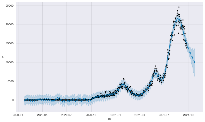
Description: From the component plot, we can see that there is currently an upward trend in the number of new Covid-19 cases in Malaysia. As for the next 30 days, it is expcted cases to be around 9790 cases with a 5972 lower bound of the uncertainty interval, and 13106 upper bound of the uncertainty interval.
#plot the components
plt2 = m.plot_components(forecast)
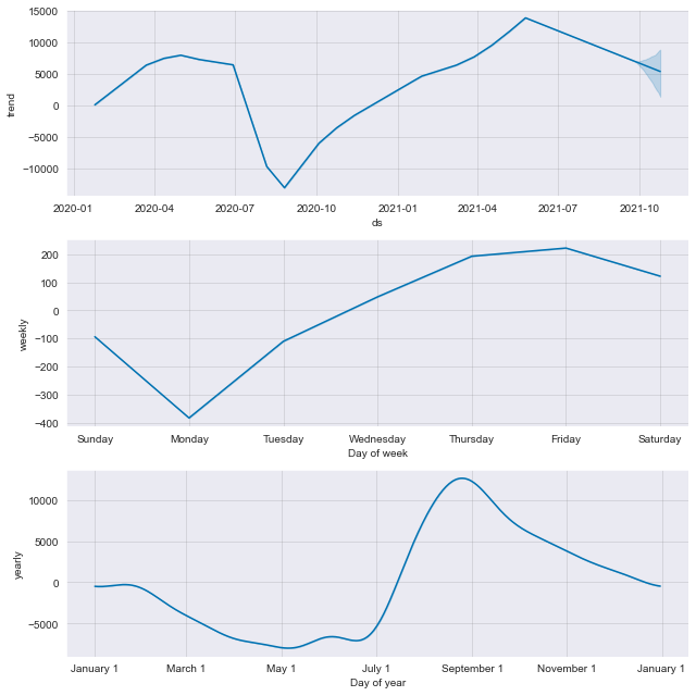
Description: From the componenets plot, we can see a strong uptrend from the beginning of August 2020 with a slowed rate around March 2021 before starting an increased rate afterwards. We can see that cases are mostly lower at Monday, increases through the week and drops slightly after Friday. There are also more cases happens around August and starts a downward trend going forward.
#save and export model
import pickle
prophet_model_save = 'prophet_model.sav'
pickle.dump(m, open(prophet_model_save, 'wb'))
Prediction Model
Data preprocessing
#make a copy of the dataframe
df=cleaned_df.copy()
#drop date column
df.drop('date',axis=1,inplace=True)
#seperate label and features
y=df['cases_new']
X=df.drop('cases_new',axis=1)
#preview the features
X.head()
| casual_contacts | pcr | rtk-ag | deaths_new | |
|---|---|---|---|---|
| 0 | 708 | 2 | 0 | 0 |
| 1 | 713 | 5 | 0 | 2 |
| 2 | 710 | 14 | 0 | 0 |
| 3 | 713 | 24 | 0 | 0 |
| 4 | 720 | 53 | 0 | 1 |
Training and evaluation
#scale the data
from sklearn.preprocessing import MinMaxScaler,StandardScaler,RobustScaler
scaler = StandardScaler()
scaler.fit(X)
X = scaler.transform(X)

#splitting the data
from sklearn.model_selection import train_test_split
X_train, X_test, y_train, y_test = train_test_split(X, y, train_size=0.8)
#import the models
from sklearn.linear_model import Ridge
from sklearn.linear_model import LinearRegression
from sklearn.linear_model import Lasso

#define models
rid_model = Ridge(alpha=2.5)
lin_model = LinearRegression()
las_model = Lasso(alpha=18)

#fit model to data
rid_model.fit(X_train, y_train)
lin_model.fit(X_train, y_train)
las_model.fit(X_train, y_train)
Lasso(alpha=18)
#model score
print(rid_model.score(X_train, y_train))
print(lin_model.score(X_train, y_train))
print(las_model.score(X_train, y_train))
0.9555444130813269
0.9555740069562761
0.9555138155753014
#find best alpha value for lasso
from sklearn.linear_model import LassoCV
lass_cv = LassoCV(alphas=[17, 16, 18])

model_cv = lass_cv.fit(X_train, y_train)
model_cv.alpha_
18
#find best alpha value for ridge
from sklearn.linear_model import RidgeCV
regr_cv = RidgeCV(alphas=[2.0, 2.5, 2.9])

model_cv = regr_cv.fit(X_train, y_train)
model_cv.alpha_
2.5
#make predictions
rid_pred = rid_model.predict(X_test)
lin_pred = lin_model.predict(X_test)
las_pred = las_model.predict(X_test)

#r2 score
from sklearn.metrics import r2_score as r2
print(r2(rid_pred, y_test))
print(r2(lin_pred, y_test))
print(r2(las_pred, y_test))
0.9622378384917039
0.9622989469948486
0.9622047617781965
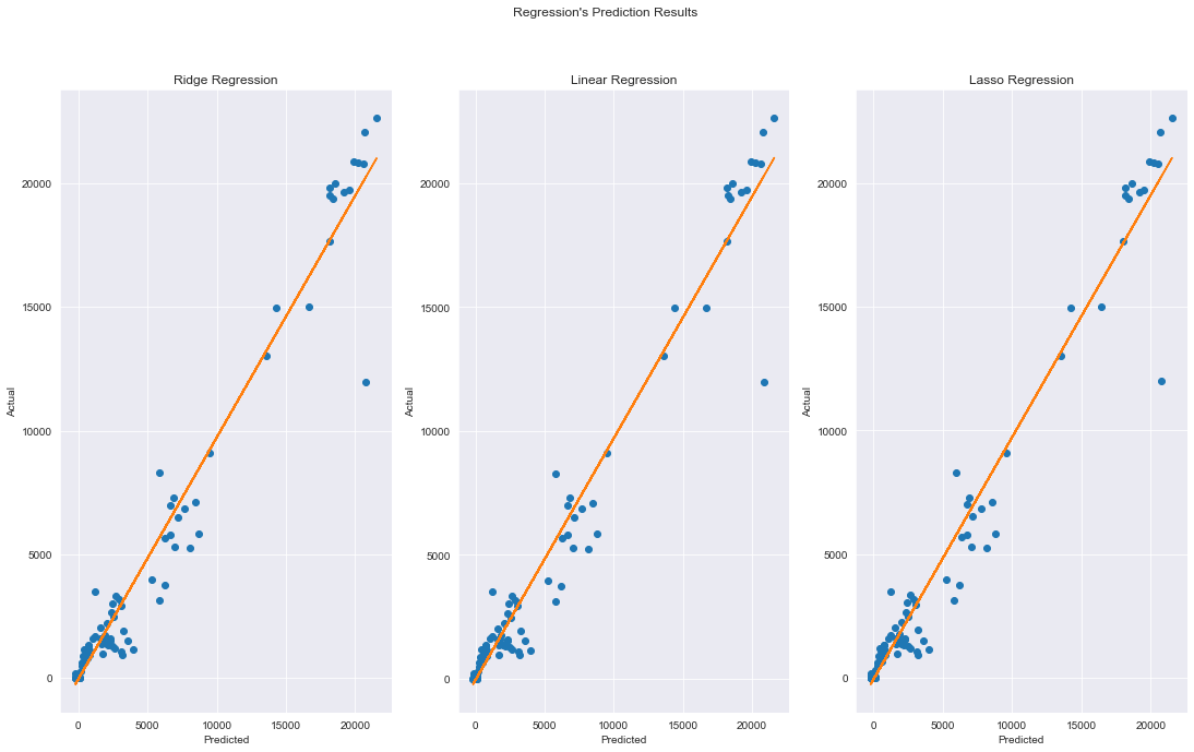
#plot prediction results
fig, axs = plt.subplots(1,3)
plt.figure(figsize=(14,8))
fig.set_size_inches(18.5, 10.5)

fig.suptitle("Regression's Prediction Results")

axs[0].plot(rid_pred, y_test,'o')
axs[0].set_title('Ridge Regression')
axs[0].set_ylabel('Actual')
axs[0].set_xlabel('Predicted')
m, b = np.polyfit(rid_pred, y_test, 1)
axs[0].plot(rid_pred, m*rid_pred + b)


axs[1].plot(lin_pred, y_test,'o')
axs[1].set_title('Linear Regression')
axs[1].set_ylabel('Actual')
axs[1].set_xlabel('Predicted')
m, b = np.polyfit(lin_pred, y_test, 1)
axs[1].plot(lin_pred, m*lin_pred + b)


axs[2].plot(las_pred, y_test,'o')
axs[2].set_title('Lasso Regression')
axs[2].set_ylabel('Actual')
axs[2].set_xlabel('Predicted')
m, b = np.polyfit(las_pred, y_test, 1)
axs[2].plot(las_pred, m*las_pred + b)

plt.show()
<Figure size 1008x576 with 0 Axes>
Description: we can see that most of the models performed well with r2 scores approximately 0.96. From the results, we can see that linear regression performed the best at predicting new cases using this dataset.
# get importance for linear regression
importance = lin_model.coef_
# summarize feature importance
for i,v in enumerate(importance):
	print('Feature: %0d, Score: %.5f' % (i,v))
# plot feature importance
plt.figure(figsize=(14,8))

sns.barplot([x for x in range(len(importance))], importance,palette="husl")
feature_names = df.columns.drop('cases_new')

#set feature name
plt.xticks(ticks=[0,1,2,3],labels=feature_names)
plt.title("Feature Importance of linear regression")
plt.show()
Feature: 0, Score: 1073.27347
Feature: 1, Score: -98.14277
Feature: 2, Score: 1192.67976
Feature: 3, Score: 3814.90664
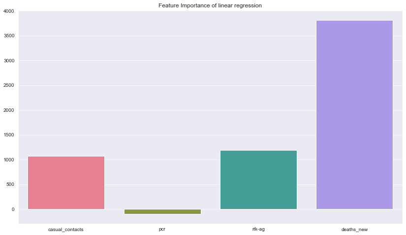
Description: Here we can see the feature importance for the best model which is linear regression. The chart shows that the values of new death cases had the biggest impact in predicting the number of new cases followed by count rtk-ag tests, casual contacts and lastly pcr tests. The dataset had very small number of features so maybe we will include more features in the future.
#save and export model
best_model_save = 'lin_model.sav'
pickle.dump(m, open(best_model_save, 'wb'))